
SouthLife.org Website Research
South Church is a nondenominational Christian church located in Lansing, Michigan. It also happens to be my church. My church’s website has recently undergone changes to help make it more usable on mobile devices. However, in these changes, several other usability concerns arose.
I was approached by a church staff member to help them understand why people were having a hard time using the site (even the staff themselves).
Normally, this would be a fairly straightforward task; I would simply run some studies, do some interviews, and come back with a list of things to change. But since this is my church and the developer is also a member of the church, I didn’t want to come across overly formal, but I still wanted my expertise to come across as well informed.
Add to this the challenges of working during the COVID-19 pandemic and with 3 children under 3, and I had to be very crafty with how to provide value to this site that I care about.
Heuristic Analysis
I decided to start the process of helping to point out usability issues with a heuristic analysis. I knew that since all of the people working on this cared deeply about the result, it would be best to attempt to relate the issues with well-established criteria for what makes a system usable.
A full, page-by-page heuristic analysis would have proved to be to costly in terms of time, so instead, I took the tact of showing a single example of each of NN/g’s 10 usability heuristics. The goal was not to browbeat the developer, but rather to help facilitate a conversation where the outcome would be a revamped site that was more holistically designed with users in mind.
This conversation did end up being productive, but it was very challenging. I attempted to communicate these things in as non-personal of a way as possible, but I fear that the developer took these things personally.
Ultimately, my time working on this led to two things; some immediate hotfixes on the current site to help alleviate some of the concerns, and an early stage basic prototype to guide future updates:
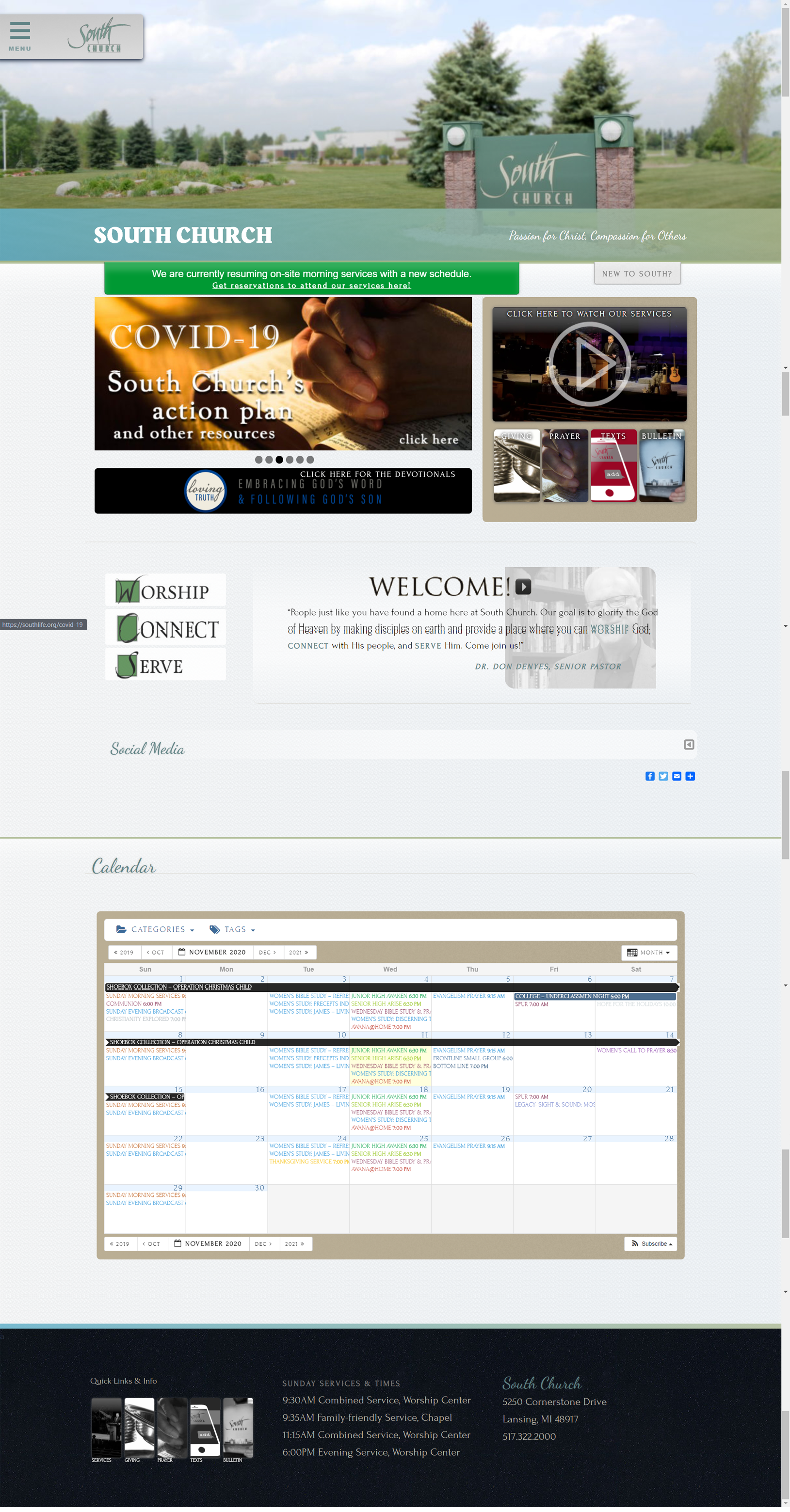
The website with hotfixes applied
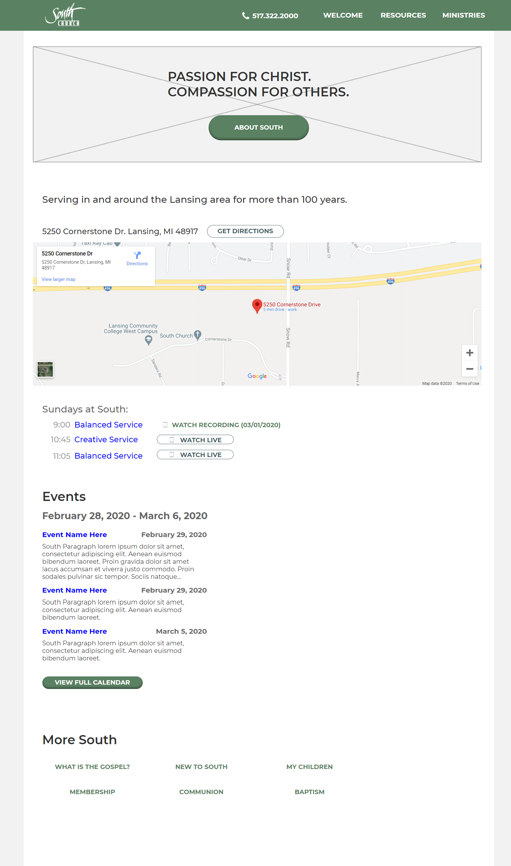
An early prototype of a redesigned page
With the hotfixes in place and an idea of where a redesign might go, I decided to perform a benchmark study to compare how usable South’s website was in comparison to another area church that matches South in terms of size and mission. This other church (University Reformed Church in East Lansing) has a website that was recently updated to a more modern aesthetic - but did that mean it would perform better than South’s?
Benchmark Usability Study
The study was performed by myself on 5 volunteer participants in various walks of life. Studies were completed remotely. I wanted to get a good sampling of different kinds of people who might be visiting sites like this, so I included some church members at South, some non-members who are Christian, and some non-Christians as well. At our outset, the goals of the website were described as:
Provide contact details about where to physically be with the church (address, phone, etc)
A quick glimpse into what we’re all about
Easily accessible information for members
A place to bring up past documents and sermons.
Using these themes as the guiding principles, I created tasks and ran 5 participants through the same 5 tasks for both South’s website and University Reformed’s website.
Findings
Recommendations
• Utilize a different menu type than the flyout.
• Overhaul Information architecture of menu.
• Simplify home page.
• Add white space to home page.
• Update static content on home page.
• Reduce image size of hero image on front page.
• create more consistent lines of sight sitewide.
• Remove accordion elements in lieu of simple content on page or into lightbox.
• If more detail is desired, run another usability study with more in depth tasks (rsvp'ing for an event, signing up to learn more about a ministry, etc.)
Outcome
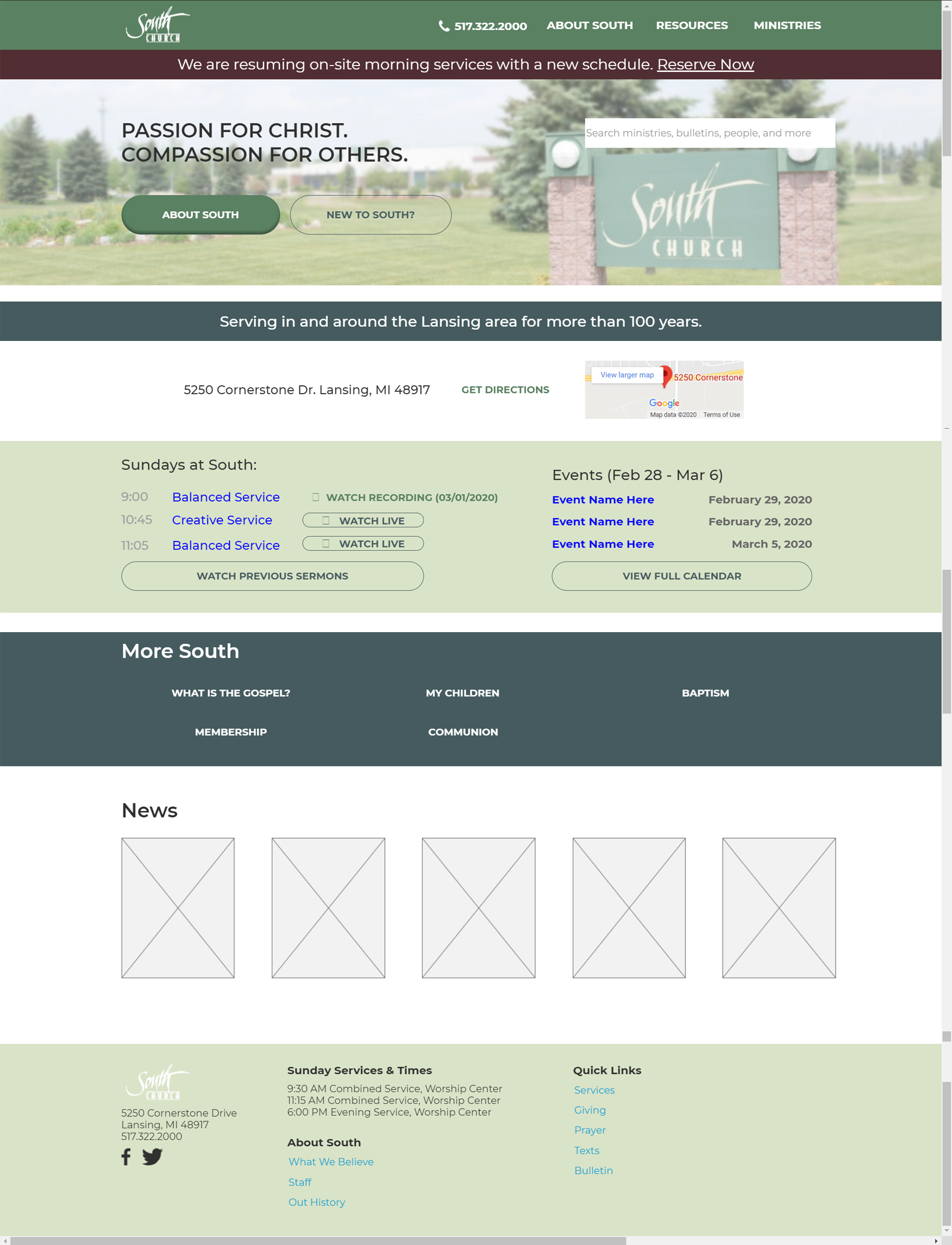
V2 of Mockups
The usability study was shared with staff members to help contextualize the concerns first uncovered during the heuristic analysis. The findings are being incorperated into a new version of the site. As a guide, a second prototype was created to help visualize what the feedback would look like when implemented.
As of writing, there has been a lot of hard work put in by the developer to implement these findings, but nothing has made it to production yet.
I’m hopeful that the combination of visual style from our developer (who is also a graphic designer) and focus on usability from these results can turn into a website that helps us further our church’s mission for God.