
Bad UX: Taco Bell Edition
This is part of a series of posts that will discuss bad experiences. The goal of these is not to complain, but rather to relate ideas about UX to poor implementations. To be honest, it’s really easy to have the best intentions in mind only to mess up the execution. Hopefully UX designers can take note and beware the pitfalls that exist.
I like Taco Bell a lot.
Let me restate that: I eat Taco Bell probably once per week on average. I really, really like Taco Bell.
But something has bothered me at Taco Bell for some time now, and I have decided that the UX issue I see anytime I set foot in a Taco Bell is worth writing about.
Taco Bell, this hurts me more than it hurts you.

This is a fairly normal drink dispenser at a Taco Bell. Apart from dispensing the delicious nectar of life called Baja Blast, this dispenser also has a feature that I have found many people don’t know about.
Look in the bottom-right corner of the image. Do you see the bank of drink icons? Did you know those are buttons? If you press those, pop comes out of the fountain! Pretty cool. As far as I can tell, the reason for these buttons has to do with the immediate context of the machine; the main buttons at the top of the image would be out of reach of many of those with mobility impairments requiring use of a wheelchair. So, the designers, not wanting those in wheelchairs to miss out on the sugary goodness of these drinks, placed buttons at a more accessible level.
As clever as that is, it’s terrible UX. Can you see why? Go ahead and try to figure it out, and then continue reading below.
From what I can see- the problem with the experience of these drink fountains are twofold:
Mapping Consistency: Look at how the fountains are arranged. If you just take a fast glance at the bottom-most bank of four drinks, which fountain does that map to? Tell me I wasn’t the only one that had to check three (or four) times to make sure that the bottom panel actually mapped to the panel furthest to the right! It’s really confusing to have a horizontally oriented system at top with controls mapped vertically below. It reminds me of rubbing your stomach while patting your head- It’s hard to look at the bottom panels and carry that information to the top. In fact, if for some reason you couldn’t see the top panels, you’d have no way of knowing which is which at all. In UX we talk about the consistency a lot. Consistency means that something remains the same, no matter how you try to use it. In this case, we can say that the bottom panels are inconsistent with the pattern established by the horizontal layout of the rest of the fountain. Consistency is crucial to a user’s understanding of a system. But even more important than that is whether a system is accessible to all users.
And that brings us to the more important point about why this fountain is terrible. You probably haven’t noticed it, and I admit it seems like it might be a small proportion of users who experience this problem, but this fountain is still not truly accessible. Let’s take a closer look at the bottom panels:
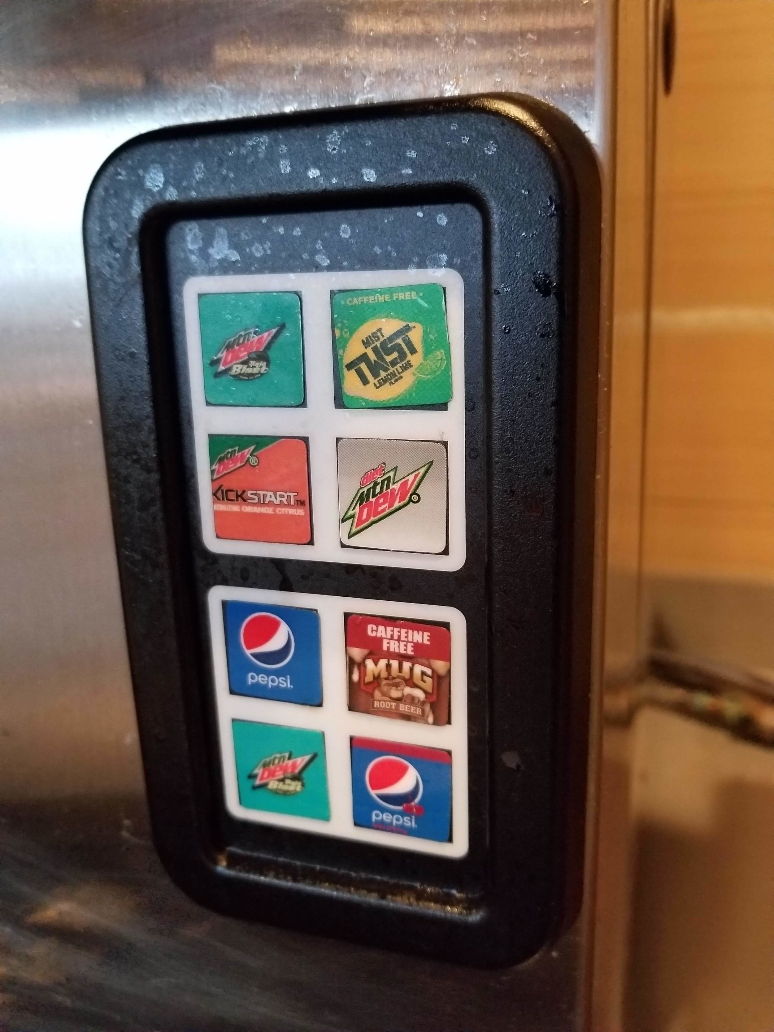
Look at how much crud is on those buttons. I tried to press one and my hand came away extremely sticky! And it’s not like it can be kept clean, because these type of fountains have some spray coming off the fountain any time it’s active. This panel is coated in sticky sugar water for the better part of the day, and people are expected to use it!
Accessibility is something that is often overlooked. In fact, in many ways, the only organizations that are focusing on accessibility are those who are legally bound to (by the Americans with Disabilities Act, or ADA). The US government, public universities, and public libraries are all entities that work hard to ensure that all people have equal access to resources. So why isn’t this true for Taco Bell? I don’t think it’s intentional, I just think that many organizations do not prioritize accessibility research!
This solution is better than not offering any accessibility options. I see why no one uses these things though- I had to go wash my hands after using it. And I do feel for those who can only choose between having sticky fingers or no pop.
Of course, all this being said… maybe this is a way to make people cut down on consuming sugary drinks by making it less appealing to acquire. If you’re wondering, that’s an example of dark design. I think I’ll write a post on that soon.